

Aashrita — Ek Ashray
- Delivered
- Logo · Stationery · Notebooks · Business cards
- Palette
- 4 colours, measured off the artwork
The palette
Sampled from the artwork itself — not matched by eye. Click a chip to copy its hex.
The mark
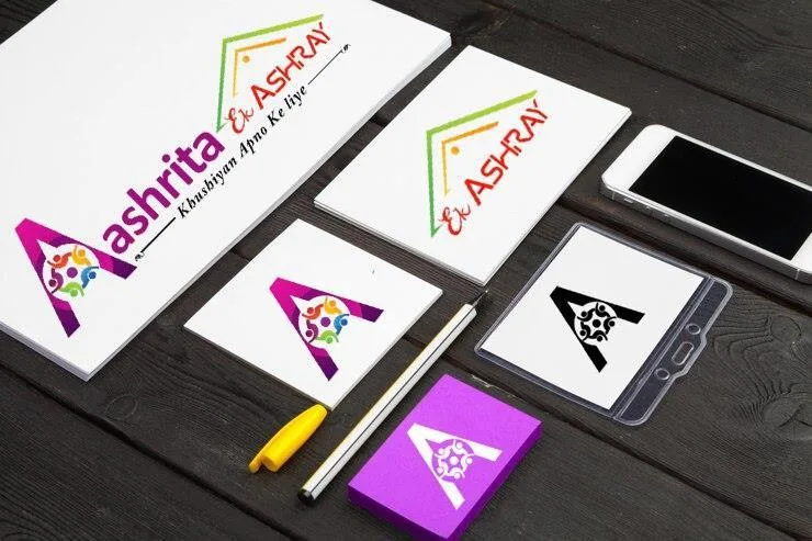
A capital A holding a ring of people. The letter is drawn as a solid magenta-to-purple wedge, and its counter — the triangle a capital A encloses — is filled with small figures in green, blue, orange and yellow, arms out, arranged as a circle rather than a row. The A is the roof; the figures are who is under it. Ek Ashray means one shelter, and the mark is the phrase rather than an illustration of it.
Above the wordmark a second element draws a peaked roofline in a green-to-orange gradient over the words Ek Ashray, repeating the shelter shape in outline so the identity has both a solid and a linear form to work with.
Deep purple to bright magenta carries the letter, with the multicolour reserved entirely for the figures — the only place in the system where more than one hue appears at once. On the stationery the mark also runs as a single-colour black, where the figures survive as cut-outs.