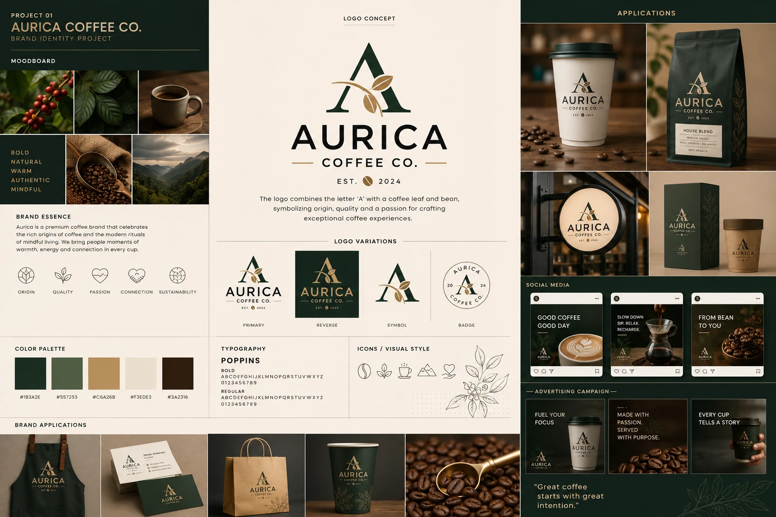
Aurica Coffee Co.
A self-initiated concept, not client work. There was no brief, no budget and no launch behind it — the exercise was to take one…


Selected work
Every project here was built to do a job — be remembered, be chosen, be defended by the people who own it. Identities first, then the sites we built.
Marks, wordmarks and the systems around them. Each case study lists the palette, measured off the artwork rather than matched by eye.
A self-initiated concept, not client work. There was no brief, no budget and no launch behind it — the exercise was to take one…
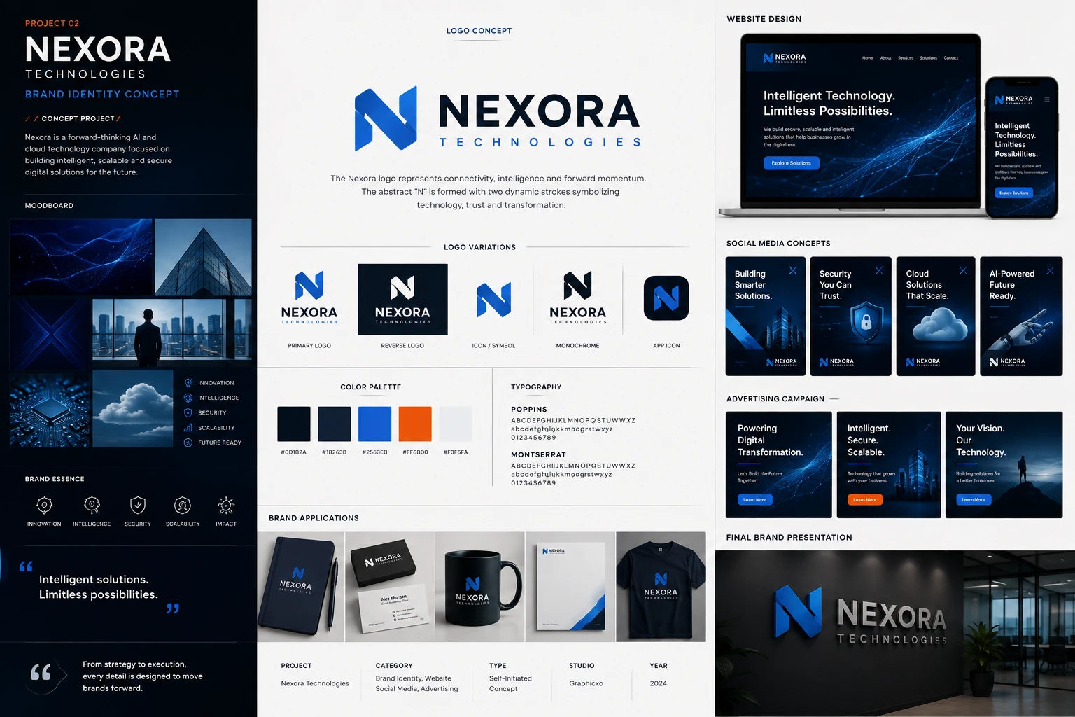
A self-initiated concept, not client work. Nexora does not exist: the board states its own terms — type, self-initiated concept; studio, Graphicxo; year, 2024…
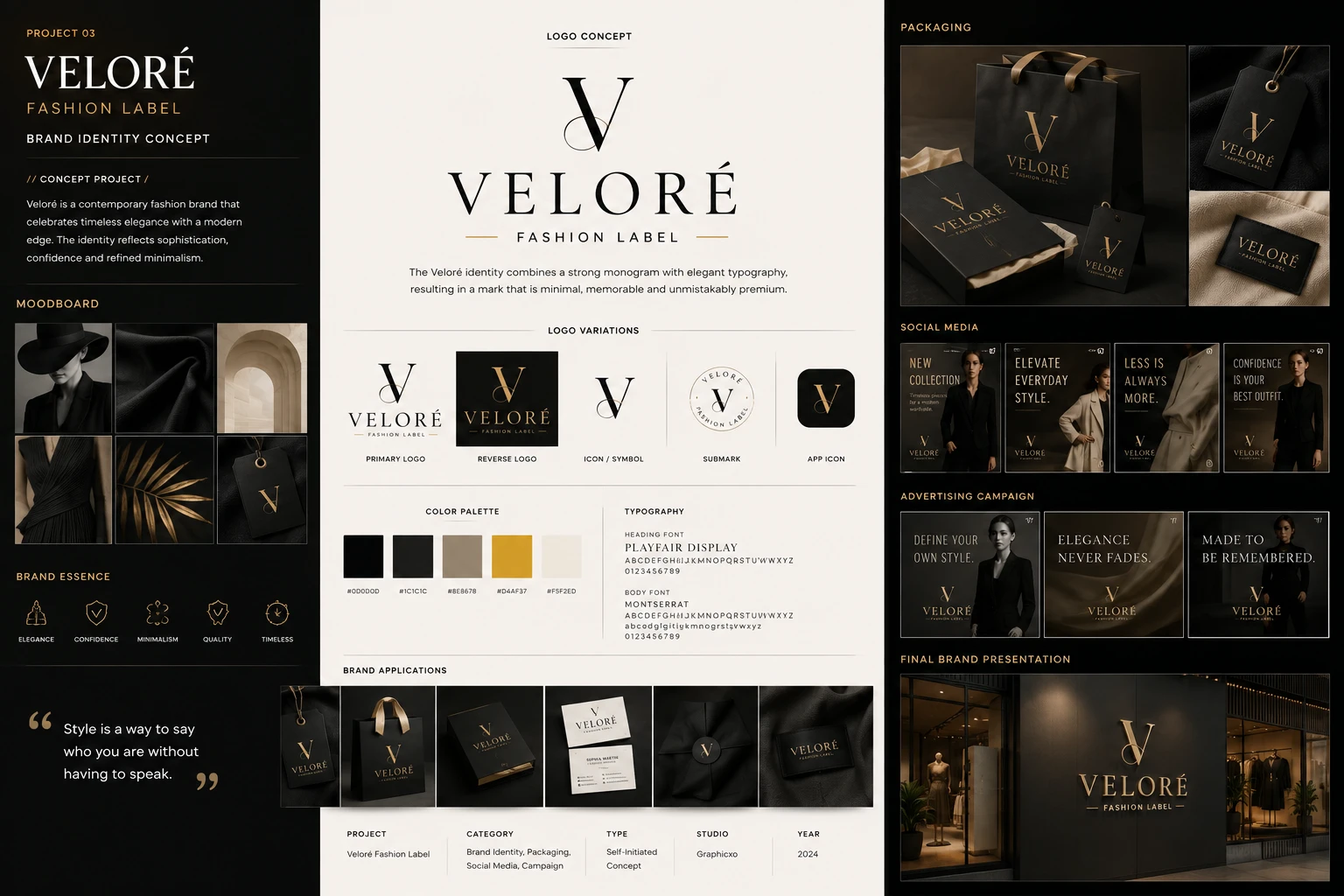
A self-initiated concept, not client work. Veloré does not exist: the board states its own terms — type, self-initiated concept; studio, Graphicxo; year, 2024…
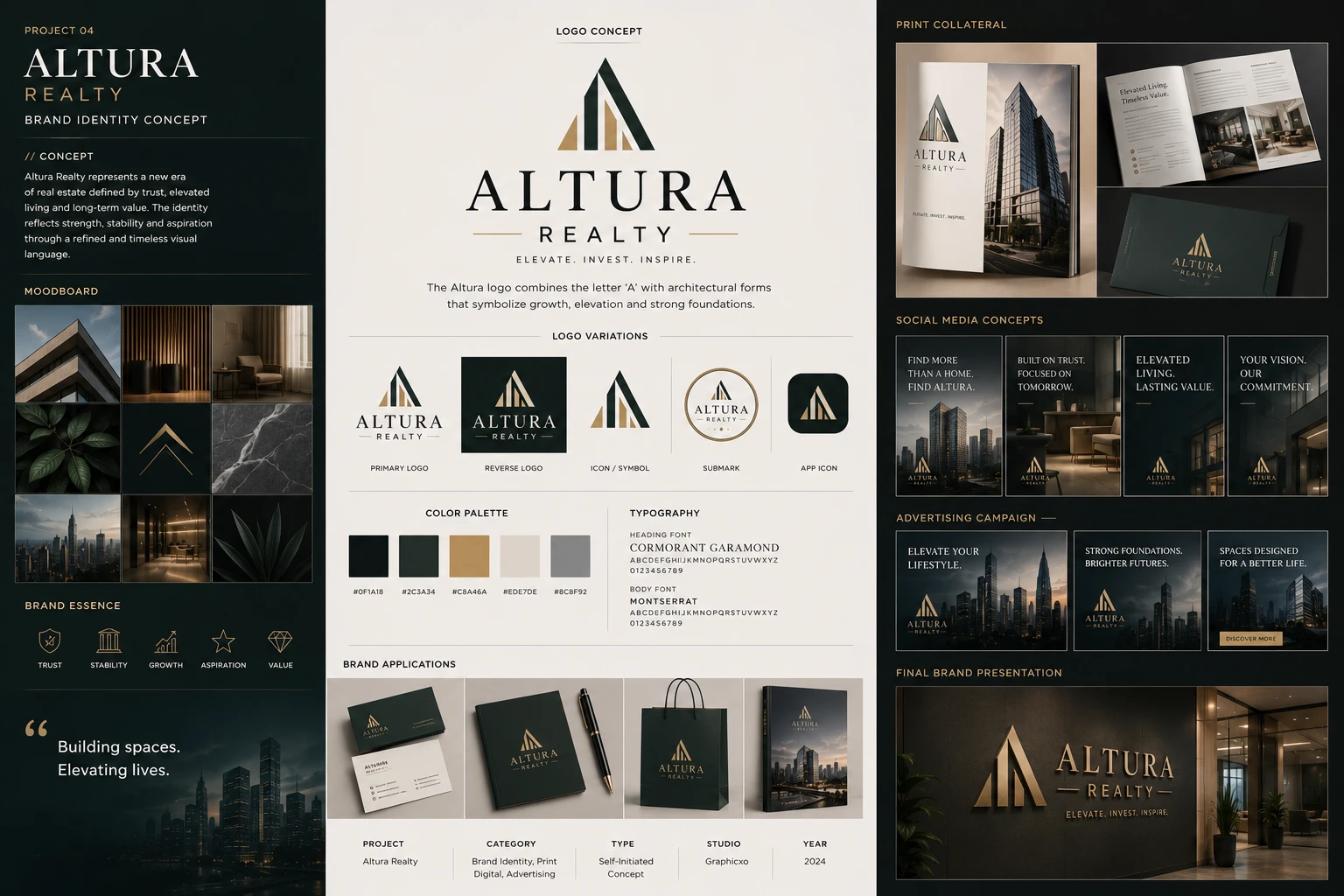
A self-initiated concept, not client work. Altura does not exist: the board states its own terms — type, self-initiated concept; studio, Graphicxo; year, 2024…
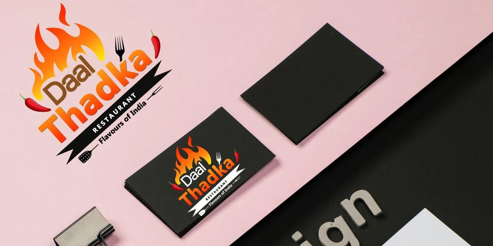
A restaurant mark built around the tadka itself — the moment spice hits hot fat. A flame rises out of the top of the…
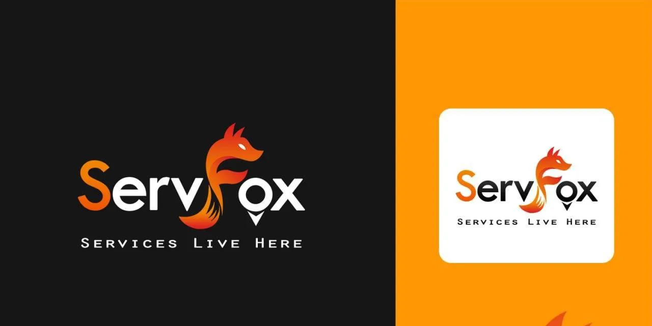
The fox is the F. Its head and ears form the letter's upper arm, the body drops into the stem, and the brush curls…

Two figures, one reaching up and one below, cut from a single ribbon that doubles as an S. Read as a letter it is…

An X and an L welded into one monogram for an IT and industrial services company — the X's descending stroke becoming the L's…
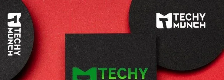
A single glyph that has to be an M and a bite at once. The outer shape is a squared M with its centre…
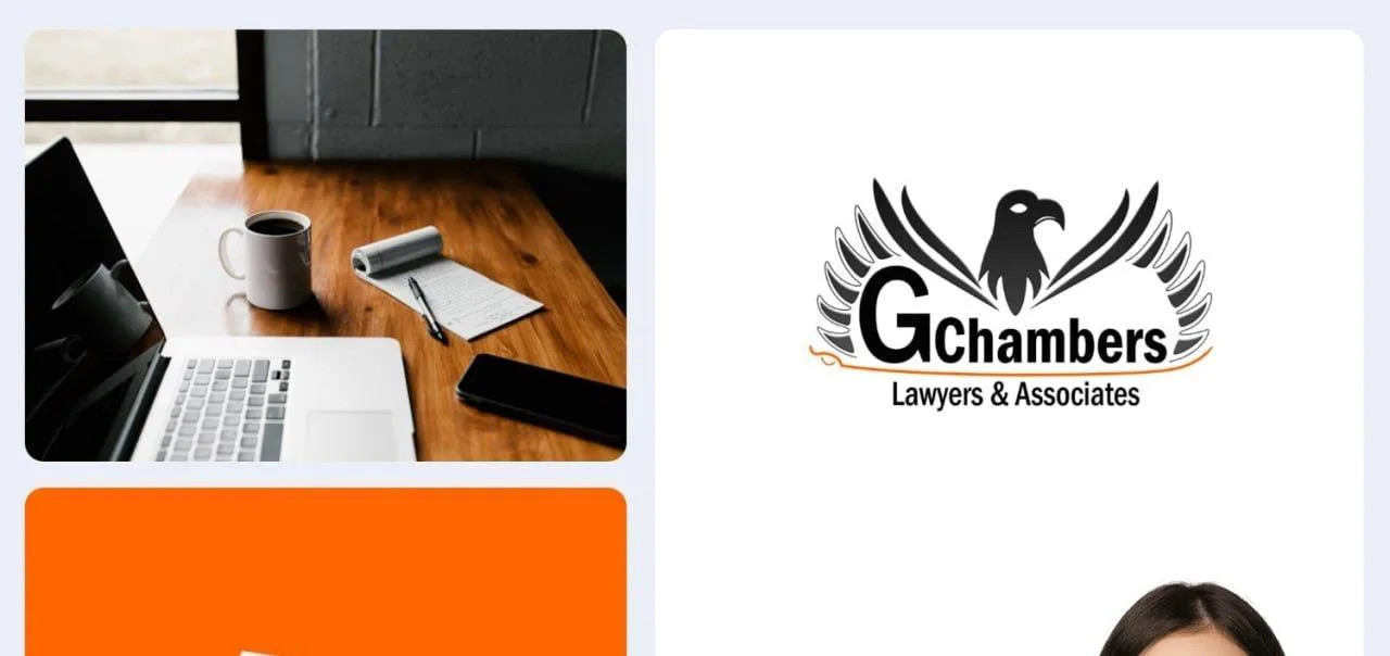
An eagle, head turned in profile, with its wings thrown open into two long fans that sweep down and around the wordmark — closer…

Apical means the summit, and the monogram says so before the name does. The A is drawn as a mountain, its right shoulder rising…

A grocery mark where the trolley and the letter are one drawing. The ascender of a script F sweeps up out of a shopping…
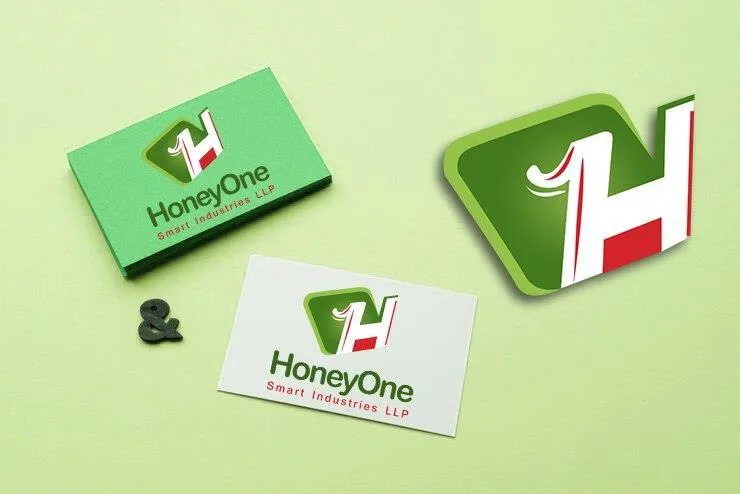
An H whose left leg is redrawn as a numeral 1 — so HoneyOne is spelled twice in one glyph, once in letters and…

A loading bar bent into an N. The mark is built from square tiles stepping up the left side, turning across the top and…
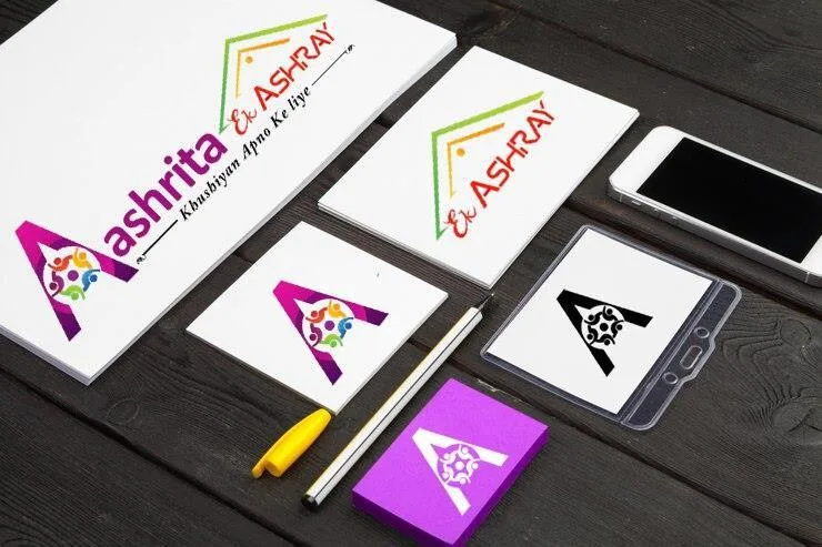
A capital A holding a ring of people. The letter is drawn as a solid magenta-to-purple wedge, and its counter — the triangle a…

A circular badge with an arrow driving up through the middle of it. The upward stroke is split into coloured facets — cyan on…
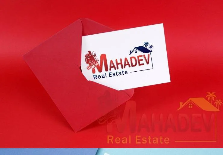
Two symbols locked into one wordmark. On the left, a red trishul and a stylised face reading as Mahadev; on the right, the V…

A monoline monogram drawn with a single pen weight throughout. The M is built from four long strokes that overshoot where they meet, leaving…
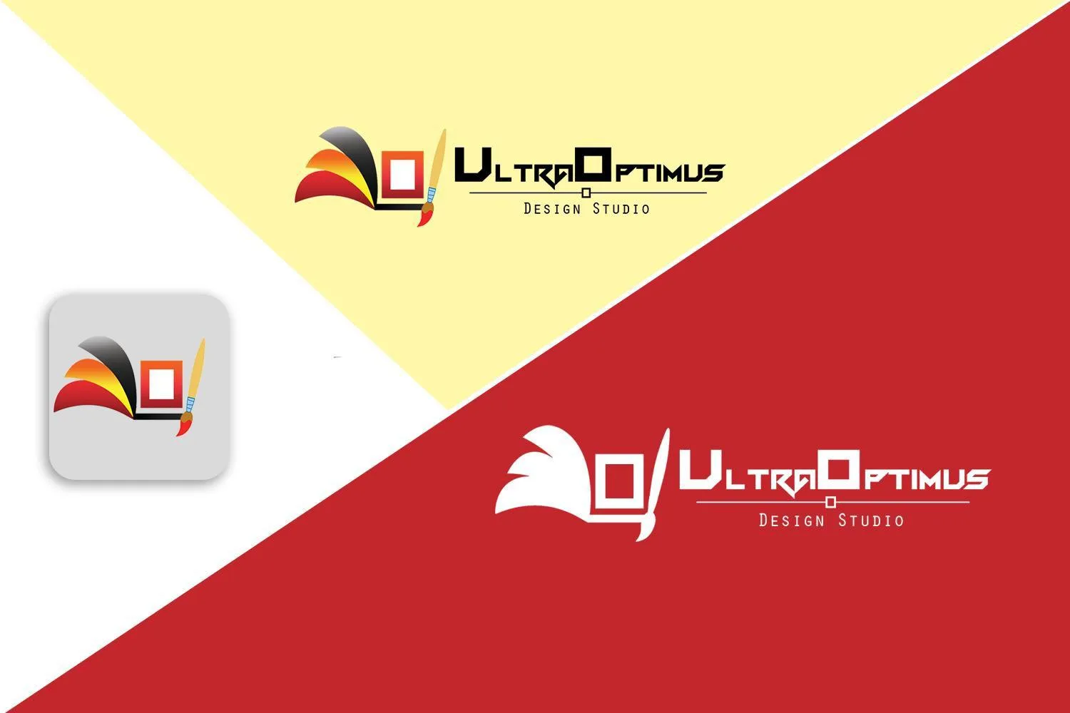
A mark for a design studio that puts the tools in the frame: a canvas drawn as a square with a hollow centre, a…
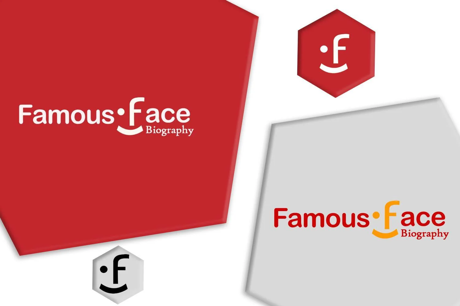
The f is a face. A dot to the left of the stem is an eye, the letter's own bowl is the second, and…
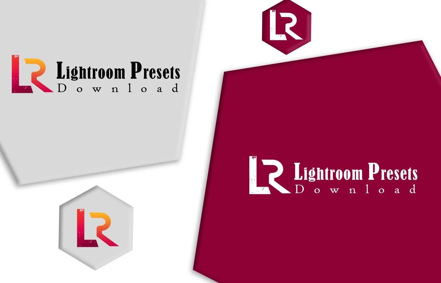
An LR monogram cut as one connected shape — the L's foot running straight into the base of the R, so the pair shares…

A script wordmark where the two capitals are the whole design. The W opens with a long flourish that loops back over itself before…
Designed and built. Every one of these has a walkthrough on its case study — the whole page, scrolled, not a screenshot of the top of it.
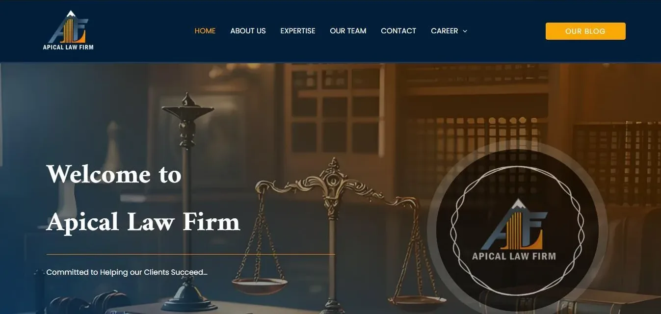
Built on the identity's own two temperatures. A deep navy masthead carries the monogram reversed to white and a six-item nav, with the one…
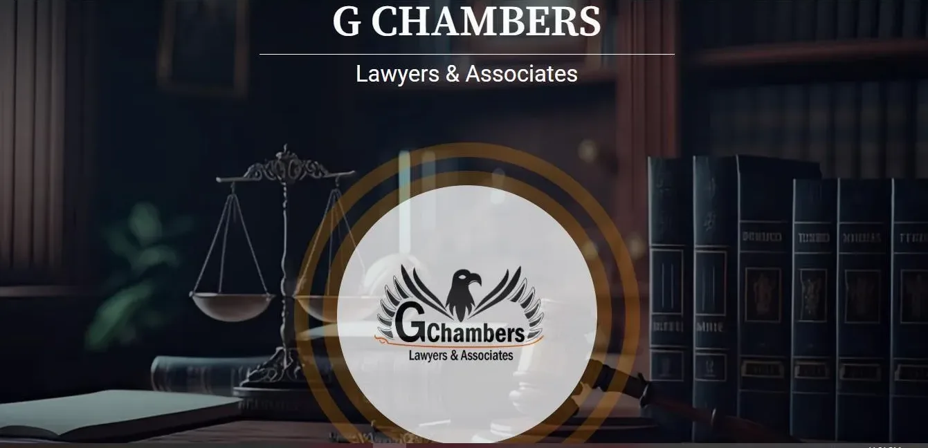
Darker and more centred than its sister site, and deliberately so: where Apical splits its hero left and right, this one puts the name…
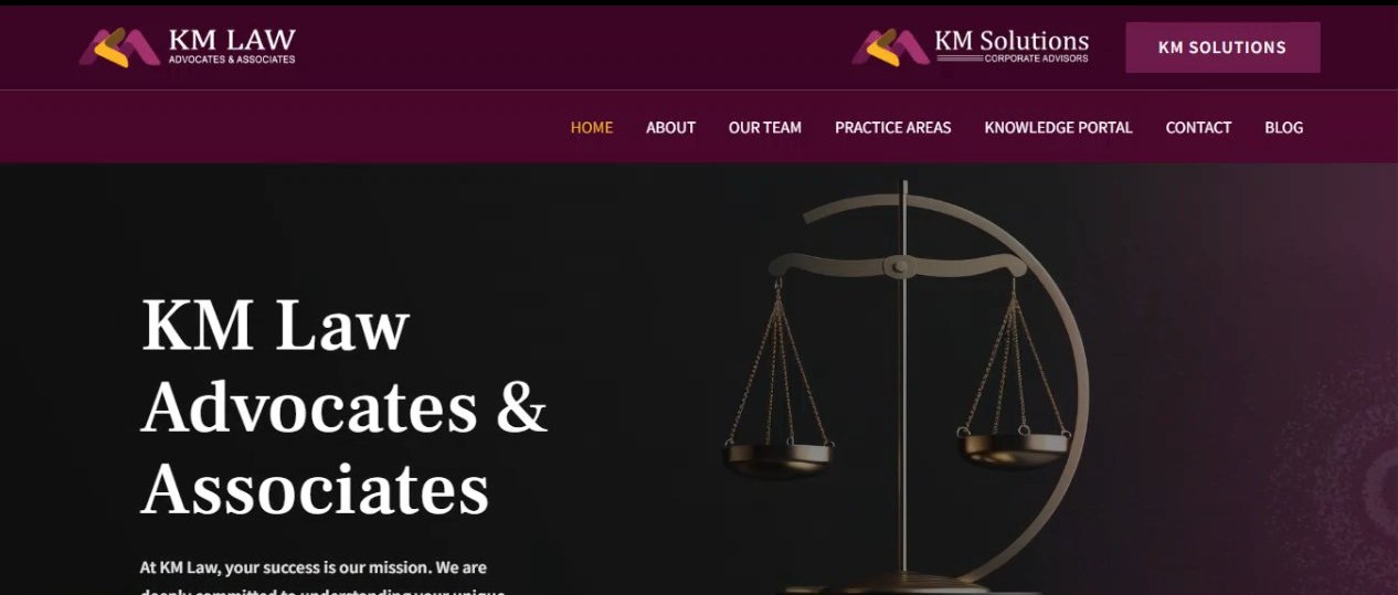
A practice site built on plum rather than the navy every law firm defaults to — a deep aubergine header band with a second,…
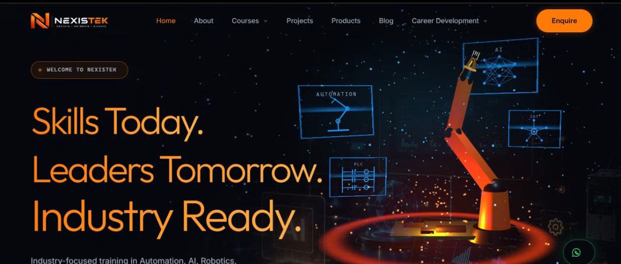
An industrial-training site — automation, AI and robotics — pitched at near-black with a single orange doing every job that matters: the headline, the…
Nothing from that year yet.