Aurica Coffee Co.
- Delivered
- Logo · Logo variations · Colour palette · Typography · Packaging · Social templates · Ad campaign
- Palette
- 5 colours, measured off the artwork
The presentation board
Self-initiated.
No client, no brief.
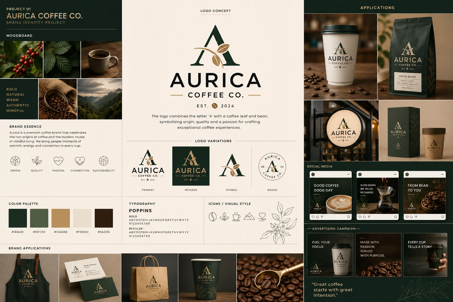
A self-initiated concept, not client work. There was no brief, no budget and no launch behind it — the exercise was to take one mark all the way through the surfaces a small coffee company actually has to pay for, from a business card to a shopfront sign, and see whether it holds at every size.
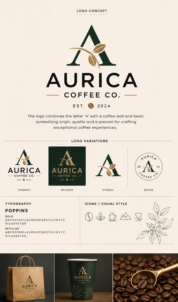
The mark is a display-serif A with a coffee branch laid across it: two leaves and a bean in gold line, crossing the letter where its bar would sit and breaking the right leg for a moment before it lands. The board states the reasoning itself — the letter and the leaf together for origin, quality and craft — and that sentence is the whole of the rationale it claims.
Four variations carry it. The primary lockup on cream with COFFEE CO. ruled off underneath and EST. 2024 below that; a reverse cut inside a deep green square where the type turns gold; the symbol alone; and a circular badge with the name set around the rim and the year split 20 · 24 either side of the letter. The badge is the test — at that diameter the branch has to survive being a few pixels wide, which is why the leaves are drawn as two solid shapes rather than as an outline.
Moodboard & essence
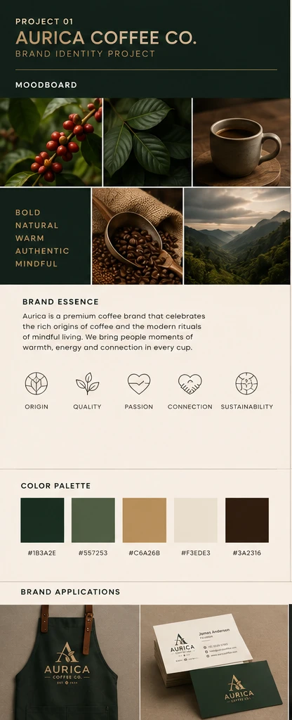
Five photographs and a word panel. Coffee cherries still on the branch, a leaf at close range, a filled cup, a scoop lifted out of a sack of beans, and a valley under low cloud — origin, plant, ritual, product, place.
The words sit where a sixth photograph would: bold, natural, warm, authentic, mindful, reversed out of the deep green. Putting them inside the grid rather than under it is what stops them reading as a caption on someone else's pictures.
Below the essence paragraph, five line icons — origin, quality, passion, connection, sustainability — drawn on one stroke weight and one corner radius, which is what lets them stand in a row without rules between them.
Logo & identity
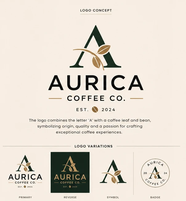
A display-serif A with a coffee branch laid across it. Two leaves and a bean in gold line cross the letter where its bar would sit, and the branch breaks the right leg for a moment before it lands — the one place the mark lets a shape interrupt a stroke.
Four variations, and each is a different problem. Primary, on cream, with COFFEE CO. ruled off underneath between two gold hairlines. Reverse, cut into a green square where the whole lockup turns gold. Symbol, the letter and branch with no words at all. And badge, a ring with the name set around the rim and the year split 20 · 24 either side of the letter.
The badge is the test. At that diameter the branch has to survive being a few pixels wide, which is why the leaves are drawn as two solid shapes rather than as outlines — an outlined leaf fills in and becomes a blob at the size a sign or an avatar actually gets seen.
Colour & typography
Five colours, two of which do nearly all the work. A deep forest green carries every reversed surface; the gold is held back for the branch, the hairlines and the small caps, so it never appears as a field — only ever as a line or a letter.
The mid sage between them is the quiet one, and the most useful: it is what stops the green from being a single flat area when a bag or a carton needs a second tone. Cream is the paper, and the near-black brown is for body copy, because true black against these greens reads as a hole.
One typeface, Poppins, in bold and regular, with both alphabets and both figure sets shown. Alongside it the visual language: five line icons, a botanical drawing of a coffee branch, and a dot grid — the geometric sans is the voice and the drawn line is the texture.
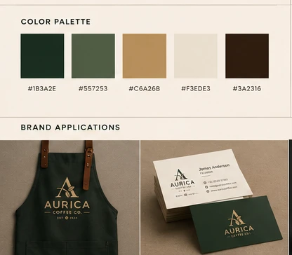

The five values the board prints under its own swatches. Click a chip to copy the hex.
Applications & packaging
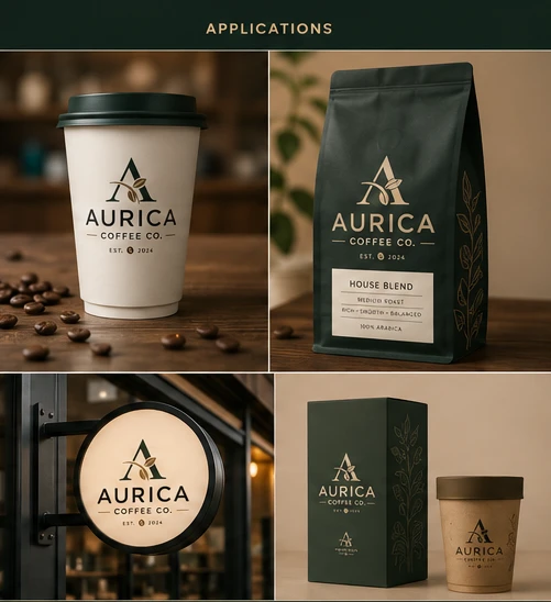
Four surfaces, four different jobs for the same lockup. On the white takeaway cup it runs in full colour at its largest, with EST. 2024 and the bean under the rule. On the matte green pouch it reverses to gold, and the botanical line drawing runs up the right-hand seam where a photograph would normally go — the pack is typographic, not pictorial.
The pouch is the only piece carrying product copy: House Blend, medium roast, rich · smooth · balanced, 100% arabica, boxed off in a cream label so the information sits in a panel rather than on the bag.
The shopfront sign is where the badge earns itself — a lit circle on a black bracket, read from across a street at an angle, which is the one condition none of the flat mockups test. Beside it the retail carton and a kraft tub: green box, gold line, the symbol alone at the foot.
Social & advertising
Three posts, drawn inside the app's own frame so the templates are judged where they will actually be seen. Good coffee, good day over a latte; Slow down. Sip. Relax. Recharge. over a pour-over mid-stream; From bean to you over a bowl of beans. The badge sits bottom-left on all three, small, always in the same corner.
The campaign frames drop the frame and go darker. Fuel your focus, Made with passion. Served with purpose., Every cup tells a story — type set left, product held right, and one gold hairline above each line as the only ornament.
It closes on a line rather than a logo: "Great coffee starts with great intention." — set large against the botanical drawing, which is the one place on the whole board the illustration is allowed to be the picture instead of the trim.

The board, at reading size
The sheet above holds the whole system in one frame, which is how it was made to be seen — and too small to read. These are its centre and right columns at full height. Open either one to read it.