Nexora Technologies
- Delivered
- Logo · Logo variations · App icon · Colour palette · Typography · Stationery · Merchandise · Website design · Social templates · Ad campaign
- Palette
- 5 colours, measured off the artwork
The presentation board
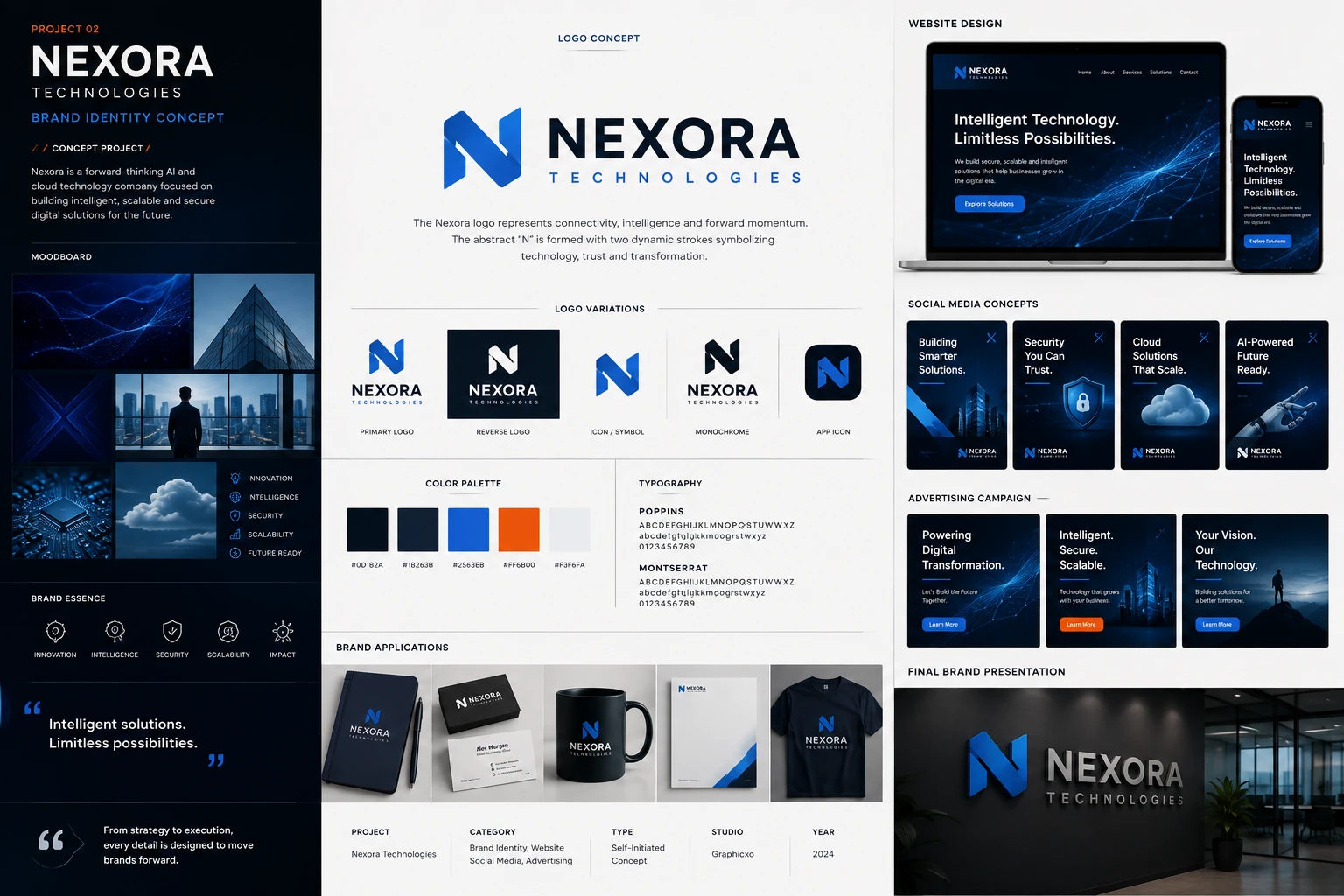
Self-initiated.
No client, no brief.

The board's own credits line. Type: Self-Initiated Concept. The label on this page is the artwork's, not a caption added to it.
A self-initiated concept, not client work. Nexora does not exist: the board states its own terms — type, self-initiated concept; studio, Graphicxo; year, 2024 — and the exercise was to build a technology identity that has to survive the two places tech brands usually fail, a 60px app icon and a lobby wall.
The mark is an N made of two strokes that fold rather than meet. The diagonal passes behind the left upright and returns in front on the right, with the turn shaded a darker blue, so the letter reads as one ribbon twisted through itself instead of three strokes assembled. It is drawn to lose that shading and still work — which the monochrome variation on the sheet is there to prove.
Five colours, and the discipline is in the fifth. Two navies carry the ground, the blue carries the brand, an off-white carries the paper, and a single saturated orange appears exactly three times across the entire board: one button on the website, one button in one campaign frame, and the rule under the project number. Held that scarce on a page of blue, it is the only thing left that can mean click here.
Moodboard & essence
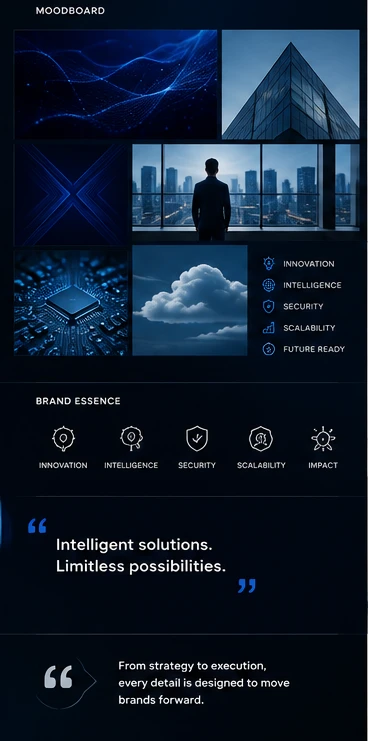
Six images and not one of them is a product. A particle field, a glass roof shot from below, a blue X of light, a figure at a window over a city at dusk, a circuit board at macro range, and a single cloud. The subject throughout is infrastructure and distance — the things a cloud company sells are not things you can photograph, so the board photographs the scale instead.
Every frame is the same temperature. Blue on near-black, one light source, no warm tone anywhere on the column — which is what lets six unrelated stock images read as one set rather than as a mood board.
Five words carry the positioning twice: once as a list beside the grid, once as line icons under it — innovation, intelligence, security, scalability and, in the icon row, impact in place of future ready. The two lists do not quite agree, which is the kind of thing a real style guide has to resolve before it ships.
It closes on the positioning line: Intelligent solutions. Limitless possibilities. — the same sentence the website hero uses, set here in quotes at the foot of the column.
Logo & identity
An N built from two strokes that fold rather than join. The diagonal crosses behind the left upright and comes forward again on the right, and the fold is shaded a darker blue — so the letter reads as one ribbon turned through itself instead of three separate strokes. The board's own line for it: connectivity, intelligence and forward momentum.
The wordmark is set in wide caps with TECHNOLOGIES letterspaced underneath at about a third the size, in the blue rather than the navy — the only place in the lockup where the accent carries type instead of a shape.
Five variations, and the last two are the ones that matter. Monochrome proves the fold survives with no colour to explain it, which is the real test of a mark whose whole idea is a change in depth. App icon is the same symbol in a rounded square, and it is where the wordmark is dropped entirely — at 60px there is no room for a second element, so the N has to be the whole brand on its own.

Colour & typography
Five values, and the interesting one is the orange. Two navies do the ground — a near-black and a slightly lifted slate that separates a panel from the page without a border. The blue is the brand. The off-white is the paper. And then a single saturated orange, which appears on this entire board exactly three times: one button on the website, one button in the middle campaign frame, and the rule under PROJECT 02. It is a quantity decision, not a colour decision — held that scarce, it is the only thing on a page of blue that can be a call to action.
Two typefaces, both geometric sans, both shown in caps, lowercase and figures: Poppins and Montserrat. The board does not assign them roles, which is the one place it stops short of being a usable guide — two sans faces this close together need a stated split or the next person picks by eye.
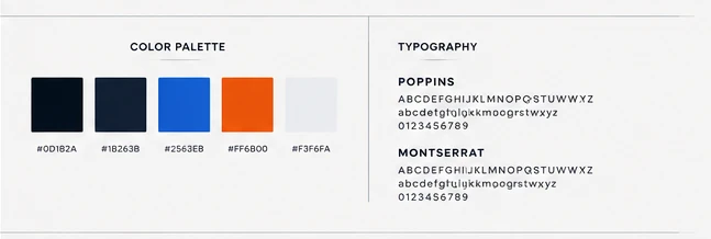
The five values the board prints under its own swatches. Click a chip to copy the hex.
Brand applications
Five objects, and four of them are navy. A notebook, a business card pair on a black box, a mug, a letterhead and a t-shirt — stationery and merchandise rather than packaging, because a cloud company ships nothing in a box.
The letterhead is the one that behaves differently: white stock, the lockup small in the top-left corner, and a single blue diagonal cut across the lower right that echoes the fold in the N without repeating it. Everywhere else the mark is centred and reversed; here it is set in a corner and the page is allowed to be mostly empty, which is what a letterhead is for.
The card back carries the mark alone on black. That is the app icon's argument made again in print — if the symbol cannot hold a surface without the name, the identity has no short form.

Website design
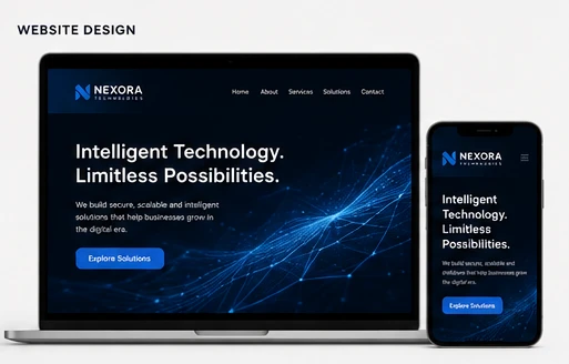
Desktop and phone, the same hero on both. Intelligent Technology. Limitless Possibilities. set left in two lines, a short paragraph under it, one blue Explore Solutions button, and a particle mesh filling the right half of the frame — the same visual language as the first moodboard image, which is the point of having had a moodboard.
The nav is five items and no more: Home, About, Services, Solutions, Contact. On the phone it collapses to a burger and the mesh is cropped rather than scaled, so the type stays the same size on both — the responsive decision most mockups skip.
This is a design, not a build. There is no live address on the board and none is claimed here; it sits with the identity because that is where the artwork puts it.
Social media
Four portrait posts on one template: headline top-left in two or three short lines, a rule under it, the lockup bottom-left, the mark repeated small top-right. Building Smarter Solutions. Security You Can Trust. Cloud Solutions That Scale. AI-Powered Future Ready.
Each carries one object and nothing else — a skyline, a padlock shield, a cloud, a robot hand — lit blue on navy so the four read as a run when they appear in a feed one after another. The template never moves; only the object and the line change, which is the whole discipline of a social system.

Advertising campaign
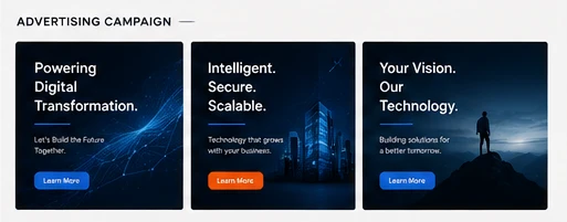
Three landscape frames, each a headline, a supporting line and a button. Powering Digital Transformation. over the particle mesh. Intelligent. Secure. Scalable. over a night skyline. Your Vision. Our Technology. over a figure on a ridge at dusk.
The middle frame is the only one with an orange button; the outer two are blue. Three ads, one accent, used once — the same restraint the palette chapter describes, applied where it is most tempting to break.
The headline structure tightens across the three: five words, then three, then four in two possessive halves. Read left to right it is a campaign learning to stop explaining itself.
Final brand presentation
The board closes where a brand actually gets judged: on a wall, at size, in a lobby with glass behind it. The N is a raised solid in the blue and the wordmark is brushed metal — so the one element rendered in the brand colour is the mark, and the name is left to the light.
It is the only frame on the whole sheet where the identity is a physical object rather than a printed surface, and it answers the question every flat mockup leaves open: whether a mark built out of a fold still reads when the fold is casting a real shadow.

The board, at reading size
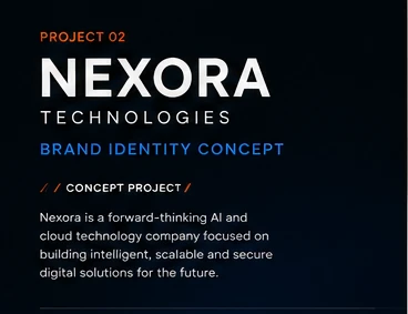
The sheet at the top holds the whole system in one frame, which is how it was made to be seen — and too small to read. This is its title block, as the board states it. Open any plate on this page to read it at full size.