G Chambers
- Delivered
- Logo · Business cards · Letterhead
- Palette
- 4 colours, measured off the artwork
The palette
Sampled from the artwork itself — not matched by eye. Click a chip to copy its hex.
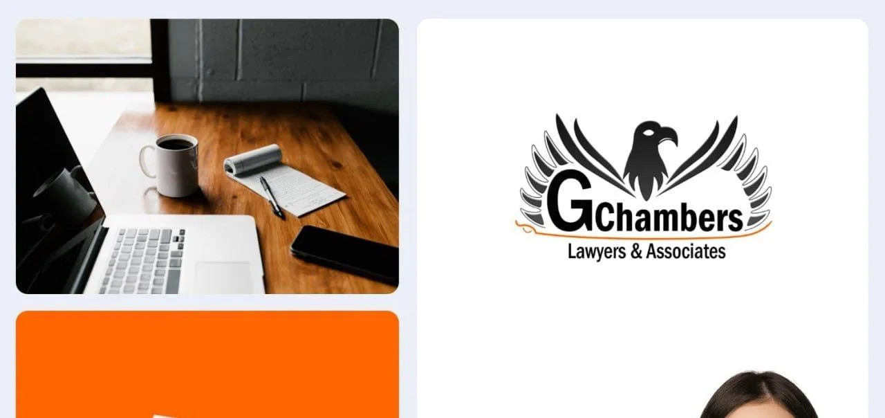
The mark
An eagle, head turned in profile, with its wings thrown open into two long fans that sweep down and around the wordmark — closer to a laurel wreath than to a bird in flight, which is the point. The feathers are cut as separate blades rather than drawn as a mass, so the silhouette keeps its detail at business-card size where a solid wing would fill in.
The G is a full-height cap that the rest of "Chambers" sits down against, and a thin orange flourish runs underneath the whole lockup — a signature line rather than a rule, and the only colour in an otherwise black-and-white identity.
Applied across cards and letterhead, where the mark holds up in solid black on white and the orange survives being reduced to a single hairline.
Applied