Techy Munch
- Delivered
- Logo · Coasters · Packaging mockups
- Palette
- 4 colours, measured off the artwork
The palette
Sampled from the artwork itself — not matched by eye. Click a chip to copy its hex.
The mark
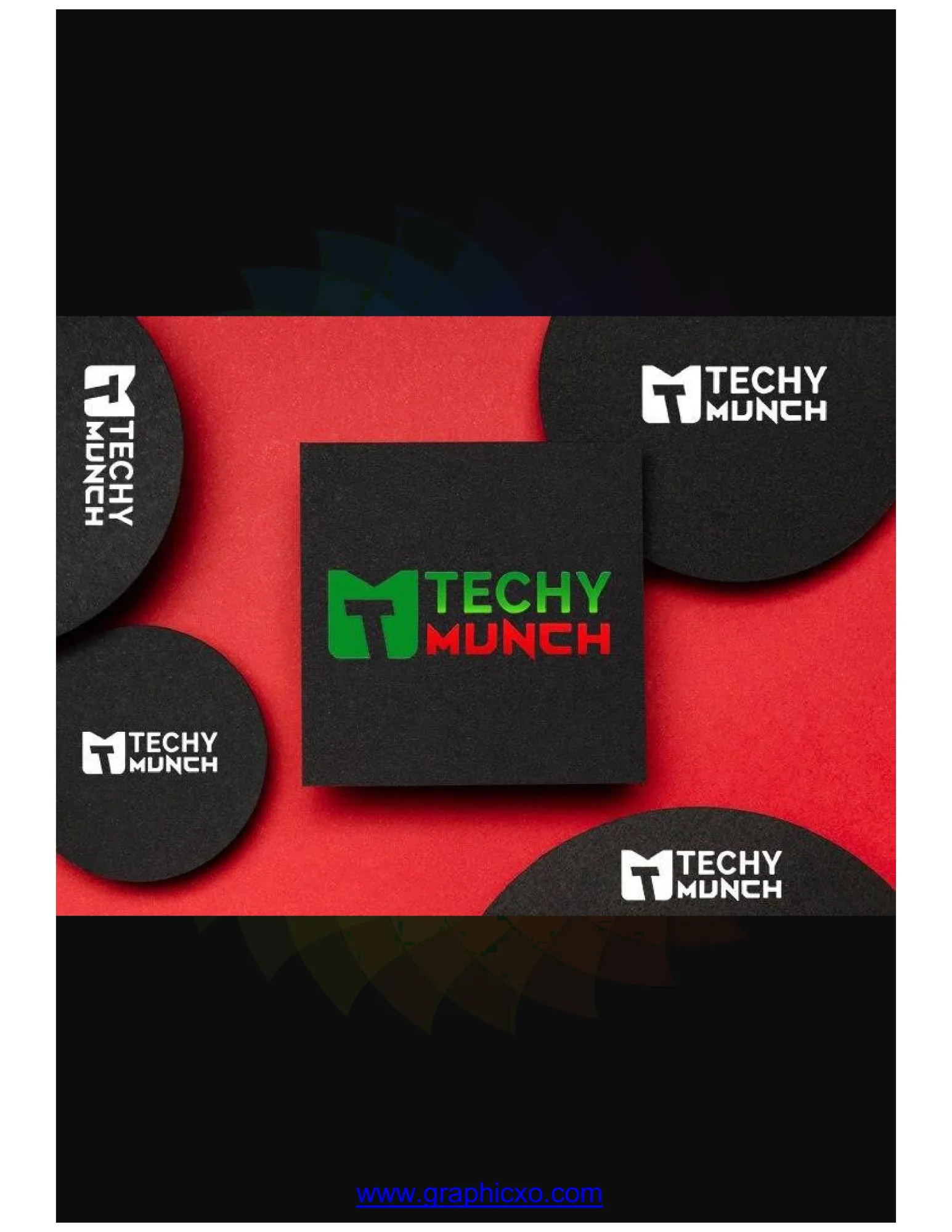
A single glyph that has to be an M and a bite at once. The outer shape is a squared M with its centre valley driven all the way down; the negative space that valley cuts is shaped as a fork, so the letter and the cutlery are the same object seen two ways. The corners are chamfered rather than rounded, which keeps the "techy" half of the name in the drawing and stops it reading as a soft food logo.
The wordmark is stacked and split across the two halves of the name — TECHY in green, MUNCH in red, in a squared sans whose flat terminals match the mark. Green and red carried at full saturation against near-black is a deliberately loud pairing; on the mockups it is calmed by putting the mark in solid white on black coasters and saving the two-colour version for the one hero surface.
Applied