

HoneyOne Smart Industries
- Delivered
- Logo · Business cards · App icon
- Palette
- 4 colours, measured off the artwork
The palette
Sampled from the artwork itself — not matched by eye. Click a chip to copy its hex.
The mark
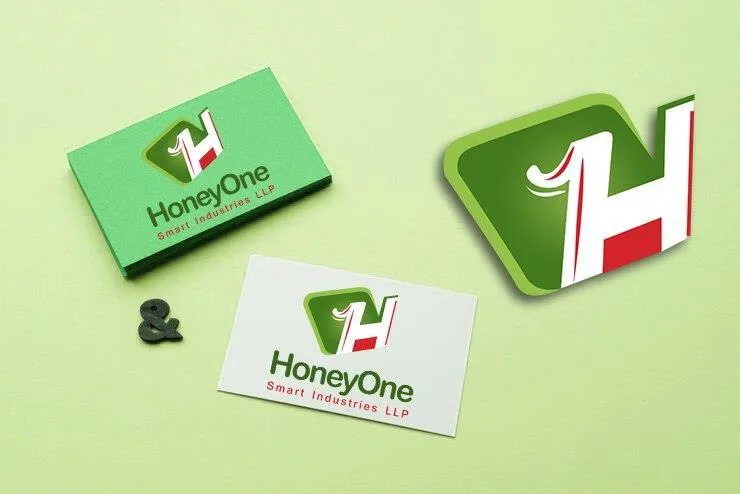
An H whose left leg is redrawn as a numeral 1 — so HoneyOne is spelled twice in one glyph, once in letters and once in figures. The 1 keeps its flag and its foot serif, which is what makes the substitution legible rather than a broken H.
The counter behind the letter is a rounded green tile, and a red vertical bar sits behind the H's right leg, showing through the white as a hard stripe. That red is doing structural work: without it the mark is a green square with a white letter, and the stripe is the only thing giving it an axis.
Green for the field, a lighter leaf green for the tile gradient, red for the accent and the Smart Industries LLP line, on a pale green stock that the cards are printed on both sides of.