

Mahadev Real Estate
- Delivered
- Logo · Business cards
- Palette
- 4 colours, measured off the artwork
The palette
Sampled from the artwork itself — not matched by eye. Click a chip to copy its hex.
The mark
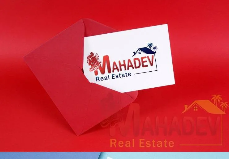
Two symbols locked into one wordmark. On the left, a red trishul and a stylised face reading as Mahadev; on the right, the V of the name carries a navy roof and a chimney, with two palms rising behind it. Between them the word runs in a heavy navy slab so the religious mark and the property mark sit at opposite ends of the same line rather than competing for the centre.
A thin rule drops from the roof and runs under Real Estate, tying the right-hand device back into the type instead of leaving it floating.
Red for the deity mark, deep navy for the architecture and the wordmark, on white cards photographed against a red envelope — the sheet uses the same red for the prop as the mark, which is what makes the card read as part of a set rather than a sample.