

UltraOptimus Design Studio
- Delivered
- Logo · App icon
- Palette
- 4 colours, measured off the artwork
The palette
Sampled from the artwork itself — not matched by eye. Click a chip to copy its hex.
The mark
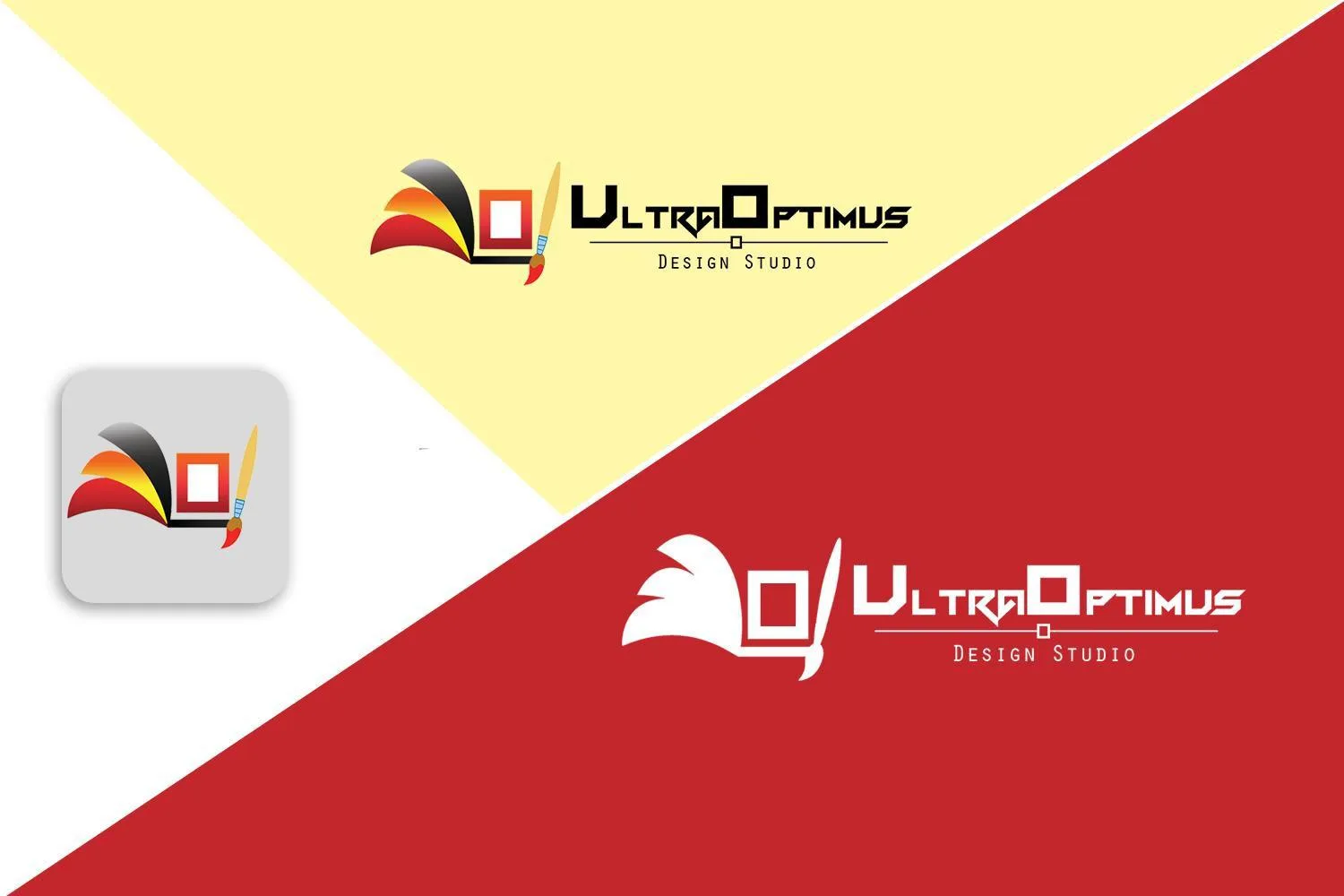
A mark for a design studio that puts the tools in the frame: a canvas drawn as a square with a hollow centre, a paintbrush crossing it at an angle, and behind both a fanned sweep of colour — black at the top edge falling through orange and gold into red — like paint pulled across the surface in one stroke.
The wordmark alternates cap heights inside a single squared face, so U, O and the shoulders of the letters step up and down through the word. A small hollow square sits on the rule beneath, repeating the canvas shape at type scale and separating Design Studio from the name.
The full-colour version needs a light ground; the sheet also shows it entirely reversed in white on crimson, where the fan becomes a silhouette and the mark survives on the shapes alone.