

Altura Realty
- Delivered
- Logo · Logo variations · Submark · App icon · Colour palette · Typography · Stationery · Print collateral · Social templates · Ad campaign
- Palette
- 5 colours, measured off the artwork
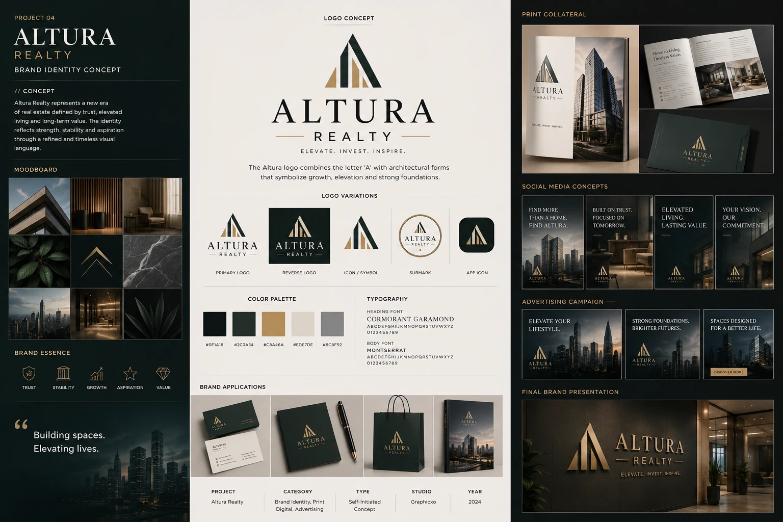
The presentation board
Self-initiated.
No client, no brief.

The board's own credits line. Type: Self-Initiated Concept. No property, no developer and no listing behind any of it.
A self-initiated concept, not client work. Altura does not exist: the board states its own terms — type, self-initiated concept; studio, Graphicxo; year, 2024 — and the exercise was a property brand carrying two things most developer identities cannot hold at once, the weight of an institution and the warmth of somewhere a person would actually live.
The mark is an A built as a building. A solid dark-green peak takes the letter's right side, and behind it three gold bars step up from left to right — a roofline, a stair, a skyline, depending on how long you look. There is no crossbar; the stepped bars do that work, which is what stops the shape reading as a mountain and keeps it architectural.
Five colours, and the two greens are the scheme. A near-black green grounds everything and a lighter forest green sits on it to separate a panel without a border — barely a shade between them, which is the point: the identity is almost monochrome, so the gold never has to compete to be seen.
Moodboard & essence
Nine frames in a three-by-three grid, and only two of them are buildings. A concrete corner against sky, a slatted timber screen, an armchair by a curtained window, a spray of dark leaves, a gold chevron, black marble, a city at dusk, a lit interior down a corridor, and an agave. Material, light and plant life — the things a property brochure photographs when it is selling a way of living rather than a floor plan.
The set is held together by temperature rather than by subject. Everything is deep green, warm brown or gold on near-black; nothing is bright and nothing is cool except the marble. That is what lets nine unrelated photographs read as one apartment building.
Five line icons carry the positioning — trust as a shield, stability as a classical portico, growth as a rising chart, aspiration as a star, value as a cut stone. Literal, deliberately: this is the one part of a property identity where a buyer should not have to interpret anything.

Logo & identity
An A built as a building. A solid dark-green peak takes the letter's right side, and behind it three gold bars step up from left to right — a roofline, a stair, a skyline, depending on how long you look at it. There is no crossbar; the stepped bars do that work, which is exactly what stops the shape reading as a mountain and keeps it architectural.
The wordmark is set in Cormorant Garamond with the letters spaced wide, REALTY smaller beneath between two gold rules, and the line ELEVATE. INVEST. INSPIRE. under that in small caps. Three tiers of type, each a step down in size and weight — the same stepping the mark is built from.
Five variations. The submark ties the whole lockup inside a thin gold ring, which is the version for a foil seal on a folder or a stamp on a contract. The app icon keeps only the peak: no name, no ring, no rules. A property brand lives on a listing app long before anyone sees a hoarding, and a mark that needs its wordmark to be recognised has already lost that surface.


Colour & typography
Five values, and the two greens are the whole scheme. A near-black green grounds everything; a lighter forest green sits on it to separate a panel without needing a border. Between them there is barely a shade of difference, and that is the point — the identity is almost monochrome, so the gold does not have to compete with anything to be seen.
Bone is the paper. The cool grey is the only value here that is not warm, and it earns its place by being the one the photography can sit against: a skyline shot dropped onto the brand's own green reads as a mistake, dropped onto grey it reads as a plate.
Cormorant Garamond for headings, Montserrat for body — a high-contrast old-style serif against a geometric sans. The serif is what makes a development look established rather than new, which is the single most useful thing typography can do for a property brand that has not built anything yet.

The five values the board prints under its own swatches. Click a chip to copy the hex.
Brand applications
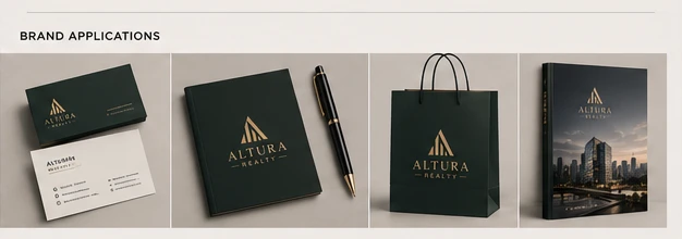
Four objects, all of them the kind a buyer is handed across a desk. A business card pair with its box, a document folder with a pen laid across it, a shopping bag, and a hardcover book with a skyline wrapped around the jacket.
Every one is the same dark green with the mark in gold, and the only variable is finish — flat on the card stock, foil on the folder, matte on the bag. That is the restraint a property identity actually needs: these items are produced in small runs by different suppliers over several years, and a system built on one colour and one foil survives that. A system built on a gradient does not.
Print collateral
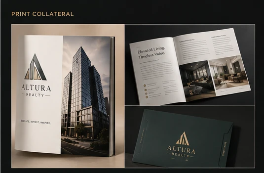
The part of a property brand that still has to be printed. A cover with a tower photographed from below and the mark reversed to gold, an interior spread, and a dark presentation folder.
The spread is where the system is tested rather than displayed. Elevated Living. Timeless Value. sits at the top left in the serif; underneath, two columns of body copy in the sans, a numbered list, and two interior photographs sharing a baseline. It is a real page layout with a real amount of text on it — which is more than most identity boards attempt, and the only way to know whether a typeface pairing works at paragraph length rather than in a specimen.
The folder carries the mark and nothing else. On the one piece that exists purely to hold other pieces, that is the correct amount of design.
Social media
Four portrait posts on one template: two short lines top-left in the serif, the lockup centred at the foot, and a single photograph behind a dark scrim. Find more than a home. Find Altura. Built on trust. Focused on tomorrow. Elevated living. Lasting value. Your vision. Our commitment.
Every headline is two sentences of two or three words. That is a tighter constraint than it looks — it forces the copy into a rhythm, and it is why the four read as a campaign rather than as four separate posts that happen to share a logo.

Advertising campaign
Three landscape frames over city photography at dusk. Elevate your lifestyle. Strong foundations. Brighter futures. Spaces designed for a better life.
Only the third carries a button — a gold Discover more — and the other two carry nothing but the line and the mark. Three ads and one call to action between them is the ratio a brand campaign runs at; a developer's listing ad would put a button on all three, and would be a different piece of work.

Final brand presentation
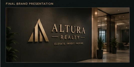
A lobby wall, lit from above, with the mark and the full lockup mounted in brushed gold on dark stone — the tagline included, which none of the smaller applications carry.
This is the frame the identity was drawn for and the one that justifies the stepped bars. At this size the three gold steps read as what they always were: a building seen from the street, standing behind its own initial.
The board, at reading size
The sheet at the top holds the whole system in one frame, which is how it was made to be seen — and too small to read. This is its title block, as the board states it. Open any plate on this page to read it at full size.
