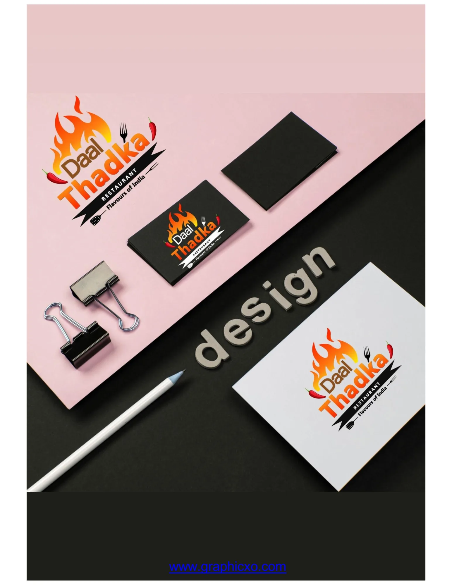
Daal Thadka
- Delivered
- Logo · Business cards · Stationery
- Palette
- 4 colours, measured off the artwork
The palette
Sampled from the artwork itself — not matched by eye. Click a chip to copy its hex.
The mark
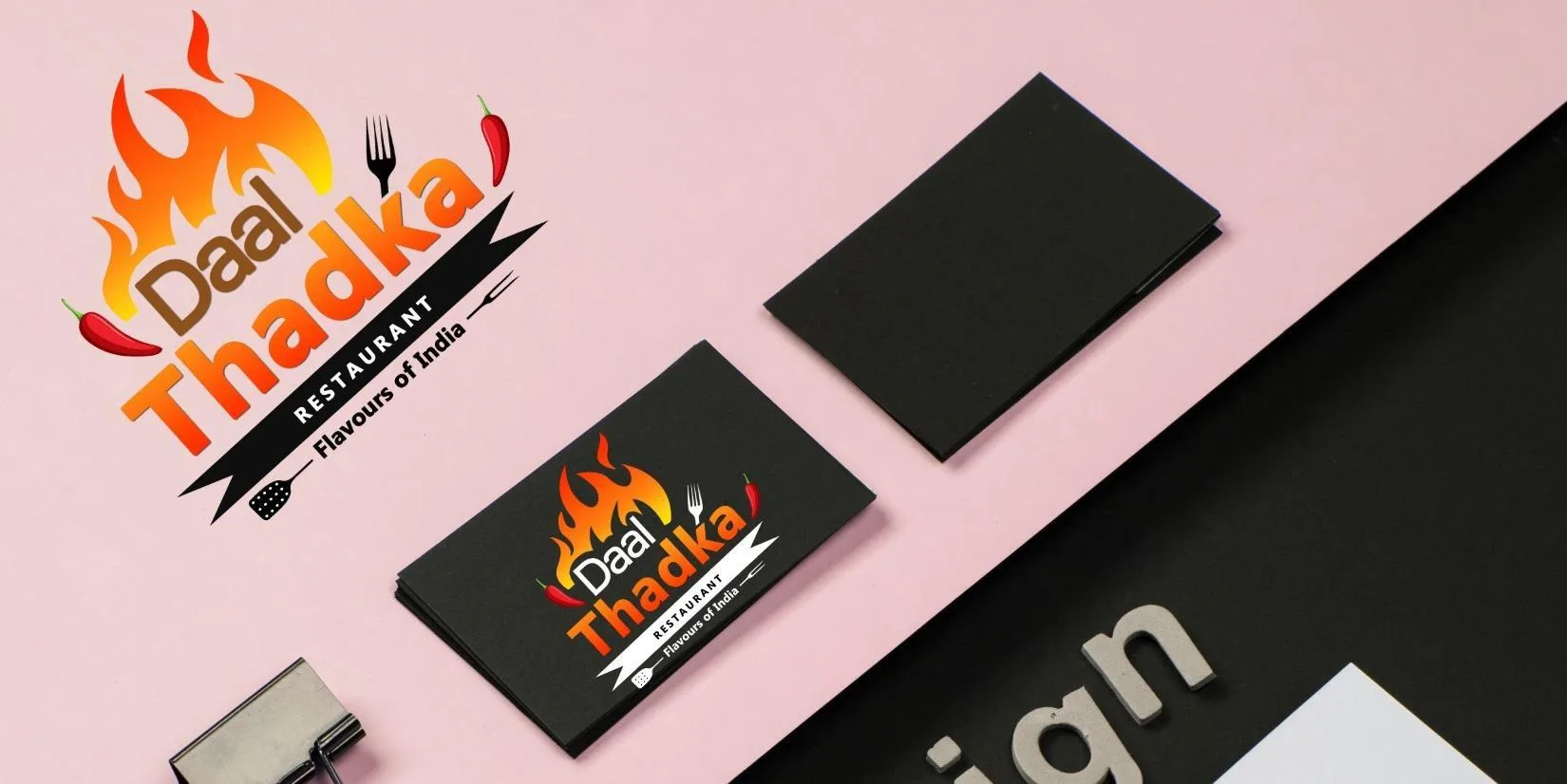
A restaurant mark built around the tadka itself — the moment spice hits hot fat. A flame rises out of the top of the lockup, drawn as separate tongues rather than one blob so it reads as movement, and two red chillies hang off the corners at opposing angles to frame the word without boxing it.
The type does the heavy lifting: "Daal" is set small and warm brown on a slight rise, "Thadka" three times its size in a heavy italic that leans into the flame. Under it a torn black banner carries Restaurant and Flavours of India, with a fork and a spatula tucked into either end of the ribbon — cutlery as punctuation rather than as a picture of food.
The palette is the fire: a saturated orange for the body of the flame, amber where it is hottest, a warm brown for the grain of the word, and near-black for the banner so the whole thing can drop onto a dark card without redrawing.
Applied