

Veloré Fashion Label
- Delivered
- Logo · Logo variations · Submark · App icon · Colour palette · Typography · Packaging · Stationery · Social templates · Ad campaign
- Palette
- 5 colours, measured off the artwork
The presentation board
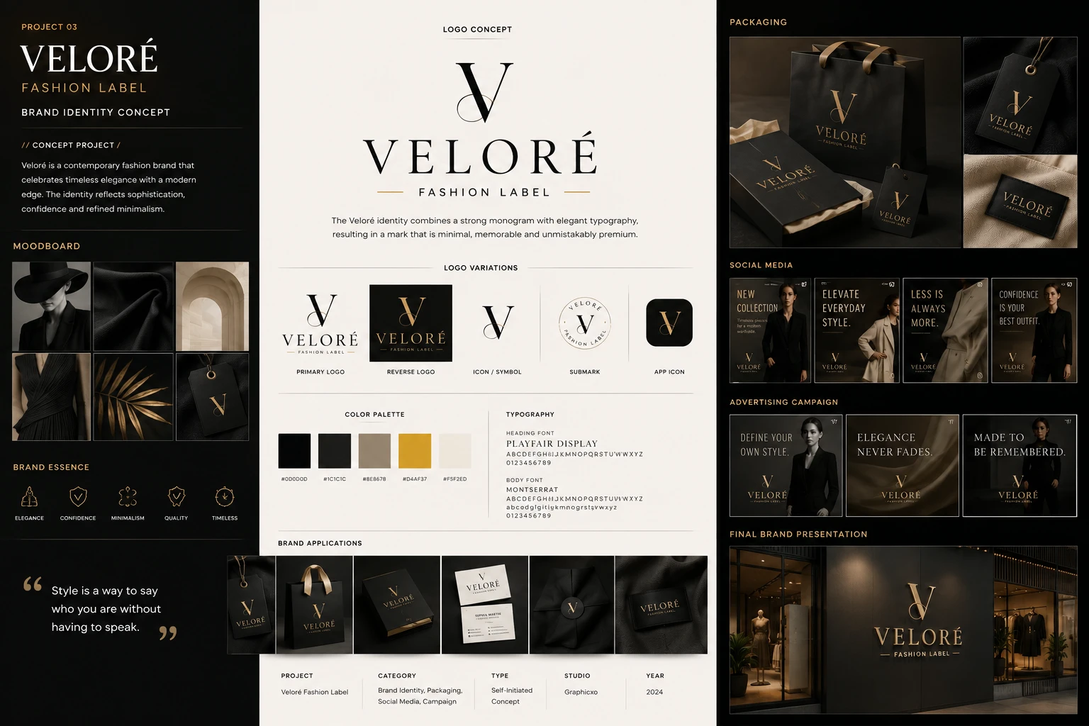
Self-initiated.
No client, no brief.

The board's own credits line. Type: Self-Initiated Concept. The label on this page is the artwork's, not a caption added to it.
A self-initiated concept, not client work. Veloré does not exist: the board states its own terms — type, self-initiated concept; studio, Graphicxo; year, 2024 — and the exercise was a fashion identity that has to hold at two extremes, a foiled hang tag the size of a business card and a shopfront sign read from across a street at night.
The mark is a V built from two strokes of very different weight: a broad blade falling left to right, and a hairline rising back through it and crossing high, so the letter keeps an open counter at the top instead of closing to a point. That thick-to-thin contrast is the same one Playfair Display carries in the wordmark underneath, which is why the monogram and the name read as one drawing rather than a mark set beside a font.
Five values and only one of them is a colour. Two near-blacks do the ground, an off-white is the paper, a warm taupe is the single soft note — and then the gold, which appears on every surface in the project and never covers more than a line's worth of any of them. On a board this dark, the restraint is the identity.
Moodboard & essence
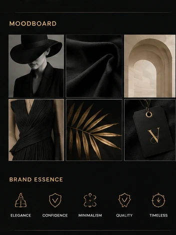
Six images and only one of them is a garment on a body. A wide-brimmed hat with the face in shadow, a fold of matte black cloth, a pale stone arch, a pleated dress lit from one side, a gilded palm frond, and a hang tag on a cord. Texture, architecture and light — the clothes are almost absent, which is the point of a moodboard for a label that has not made anything yet.
Everything is black, taupe or gold, and everything is lit from a single low source. That consistency is what stops six borrowed photographs from reading as six borrowed photographs.
Five line icons carry the positioning underneath — elegance, confidence, minimalism, quality, timeless — drawn on one stroke weight, gold on black, at a size where each is still a distinct silhouette rather than a decorated dot.
Logo & identity
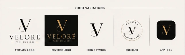
A V built from two strokes of very different weight: a broad blade falling left to right, and a hairline rising back through it and crossing high, so the letter keeps an open counter at the top instead of closing to a point. That thick-to-thin contrast is the whole idea, and it is the same contrast Playfair Display carries in the wordmark underneath — which is why the monogram and the name read as one drawing rather than a mark set beside a font.
Five variations, and the last two are the ones doing real work. The submark sets the name around a thin ring with the monogram in the middle: that is the version for a woven label, a stamp, a foil emboss on a box lid, anywhere the full lockup would be a smear. The app icon drops the name entirely and keeps the V on a rounded black square, which is the honest test of whether a monogram this fine survives being 60px of a phone screen.

Colour & typography
Five values and only one of them is a colour. Two near-blacks do the ground — one flat, one lifted just enough to separate a panel from the page without a border. An off-white is the paper. A warm taupe is the single soft note, and it appears almost nowhere: it is the colour of the arch in the moodboard and the leather in the packaging, and it exists so the black has something other than gold to sit against.
Then the gold, which is on every surface in this project and never covers more than a line's worth of any of them — the monogram, the rules under the wordmark, the foil on the bag, the lit letters on the storefront. On a board this dark, restraint is the identity.
Two typefaces with a stated split, which is the thing Nexora's board stopped short of: Playfair Display for headings, Montserrat for body. A high-contrast serif against a geometric sans — the fashion pairing, and the reason the wordmark can be set in the heading face without the small print fighting it.

The five values the board prints under its own swatches. Click a chip to copy the hex.
Brand applications
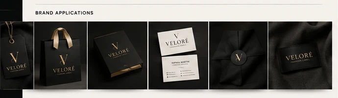
Six objects in a row and five of them are black. A hang tag on a cord, a shopping bag with grosgrain handles, a rigid box, the business cards, a wrapped garment sealed with a monogram sticker, and a woven label on cloth. The cards are the only white thing in the set, which is what makes them read as the piece you are meant to hand over.
Every one of them is the same decision: black stock, gold foil, nothing else. No secondary graphic, no pattern, no photograph. A fashion label with one mark and one finish is a fashion label whose packaging cannot go wrong at the printer.
Packaging
The one part of this identity a customer actually holds, and the board gives it the largest frame on the sheet. A matte black bag with taupe ribbon handles, a lidded box with tissue folded back, and the hang tag shot twice — once against knitwear, once flat on suede.
The tag is the detail worth stopping on. It is photographed on two different materials on purpose: gold foil on black behaves differently against a matte weave than it does against a soft nap, and a label that only ever gets photographed on white paper has not been tested on anything it will actually be attached to.
Nothing here carries a price, a size or a care symbol. That is the gap between a concept and a production spec, and it is worth naming rather than letting the mockups imply the work is finished.

Social media
Four portrait posts on one template: a short line top-left in the heading serif, the lockup bottom-left, and a single figure filling the frame. New collection. Elevate everyday style. Less is always more. Confidence is your best outfit.
The template never moves and the photography does all the changing — black tailoring, a camel coat, a pale trench, a suit. Four posts that are recognisably one account before you have read a word of any of them, which is the only thing a social system has to achieve.

Advertising campaign
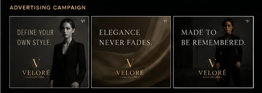
Three landscape frames, each a line and the mark and nothing else. Define your own style. over a figure in tailoring. Elegance never fades. over folded satin. Made to be remembered. over a coat in shadow.
No product shot, no price, no call to action — not one of the three asks you to do anything. That is the difference between the campaign a fashion label runs and the campaign a retailer runs, and this board commits to it: the middle frame is fabric with no garment in it at all.
Final brand presentation
A shopfront at night, lit from inside, with the monogram and the wordmark mounted in gold on a dark fascia. Mannequins behind glass either side, warm light spilling onto the pavement.
This is the frame the whole identity was drawn for. The V here is metres across and the hairline stroke is still a hairline — which is the answer to the question the 60px app icon asks from the other end. A mark that survives both is a mark that survives everything between.

The board, at reading size
The sheet at the top holds the whole system in one frame, which is how it was made to be seen — and too small to read. This is its title block, as the board states it. Open any plate on this page to read it at full size.
