LogicXomation
- Delivered
- Logo · App icon · Brand mark
- Palette
- 4 colours, measured off the artwork

The palette
Sampled from the artwork itself — not matched by eye. Click a chip to copy its hex.
The mark
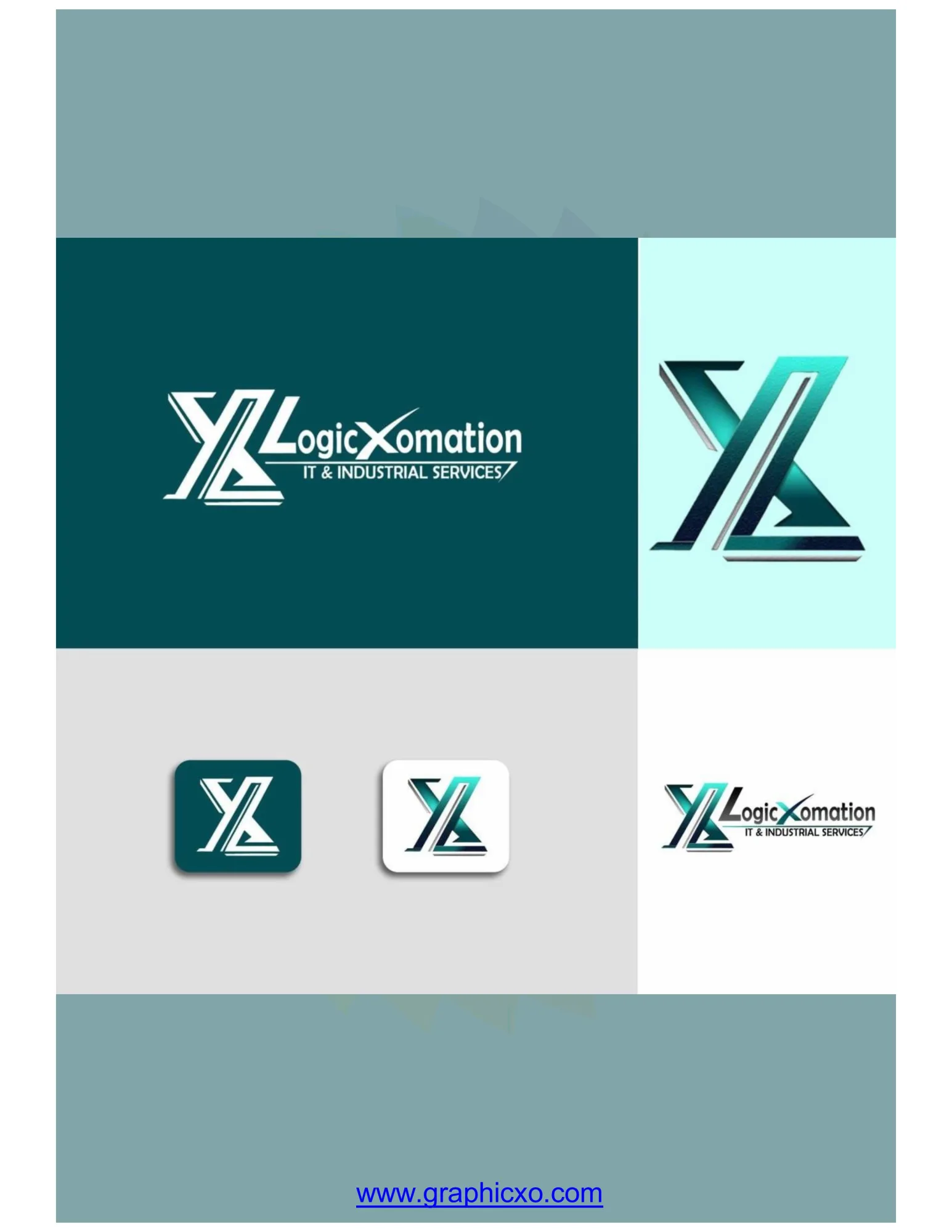
An X and an L welded into one monogram for an IT and industrial services company — the X's descending stroke becoming the L's foot, so the two letters share an edge instead of sitting side by side. Every stroke is cut with a hard bevel and a highlight rail down one side, which is the mark's one piece of theatre: it reads as folded sheet metal rather than as drawn line, and that is the industrial half of the name doing the work.
In the wordmark the X is stolen back out of the monogram and used as the letter in LogicXomation, so the same shape works at both scales. A thin rule under the word carries IT & Industrial Services and ends in a slash that echoes the monogram's angle.
Teal throughout — a deep petrol for grounds, a bright cyan for the metallic highlights, a pale desaturated tint for the light backgrounds. No second hue anywhere, which is what keeps a mark this ornate from becoming noisy.
Applied