Skillader
- Delivered
- Logo · App icon · Moodboard · Brand mockups
- Palette
- 5 colours, measured off the artwork

The palette
Sampled from the artwork itself — not matched by eye. Click a chip to copy its hex.
The mark
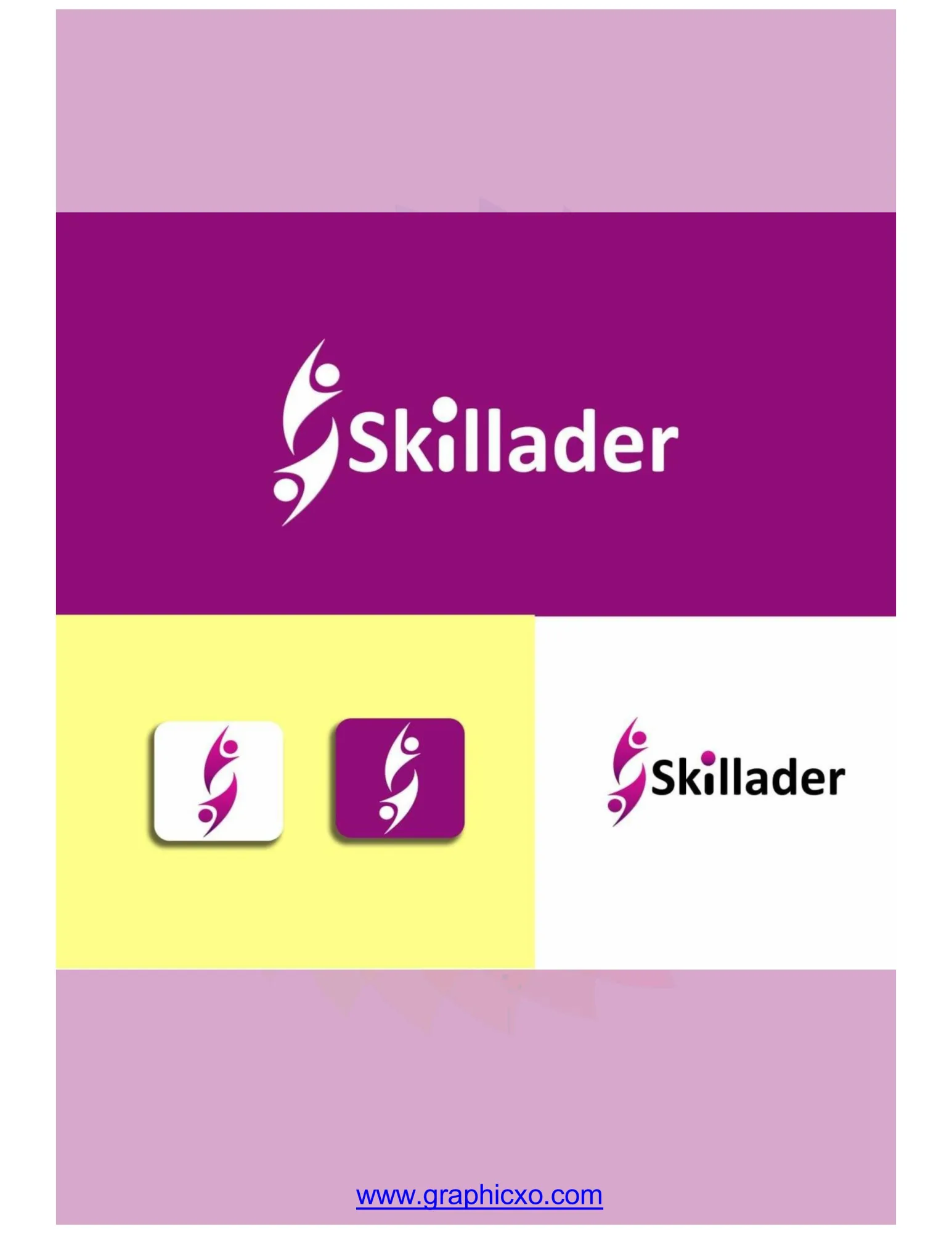
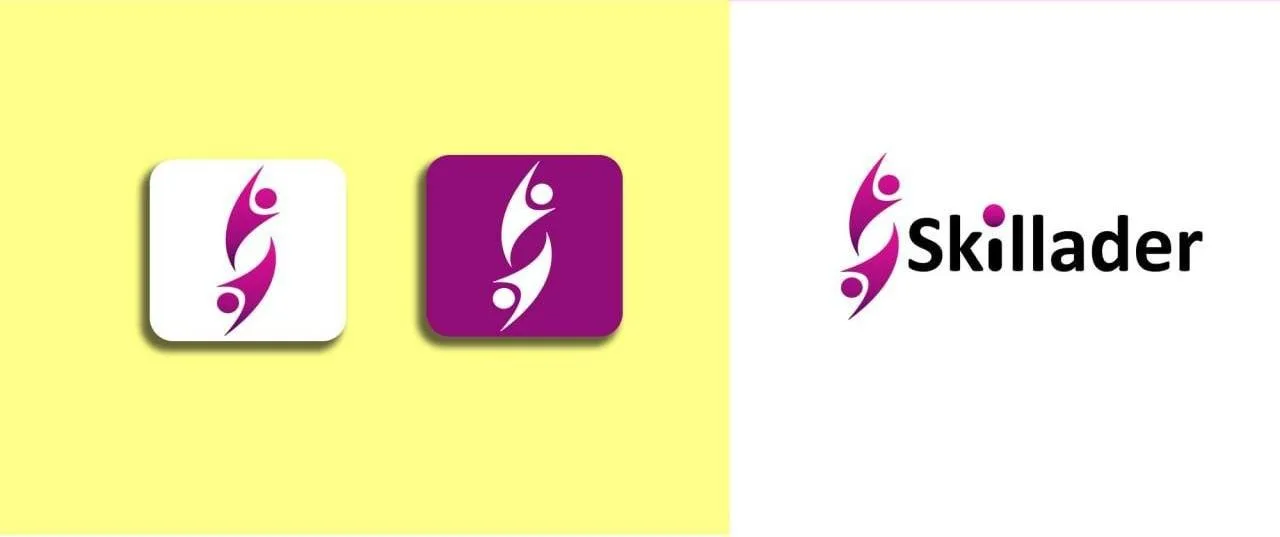
Two figures, one reaching up and one below, cut from a single ribbon that doubles as an S. Read as a letter it is the initial; read as a picture it is one person lifting another — which for a skills platform is the whole proposition in one shape. The heads are separate discs, so the figures survive being scaled down to an app tile where the thin ribbon would otherwise close up.
The magenta is unusual for the category and that is the argument for it: education brands default to blue, and this one is impossible to mistake for its competitors. It runs from a deep aubergine in the mark's heavy strokes to a bright fuchsia at the tips, with a soft lilac used for tinted backgrounds and a pale acid yellow held back for contrast panels.
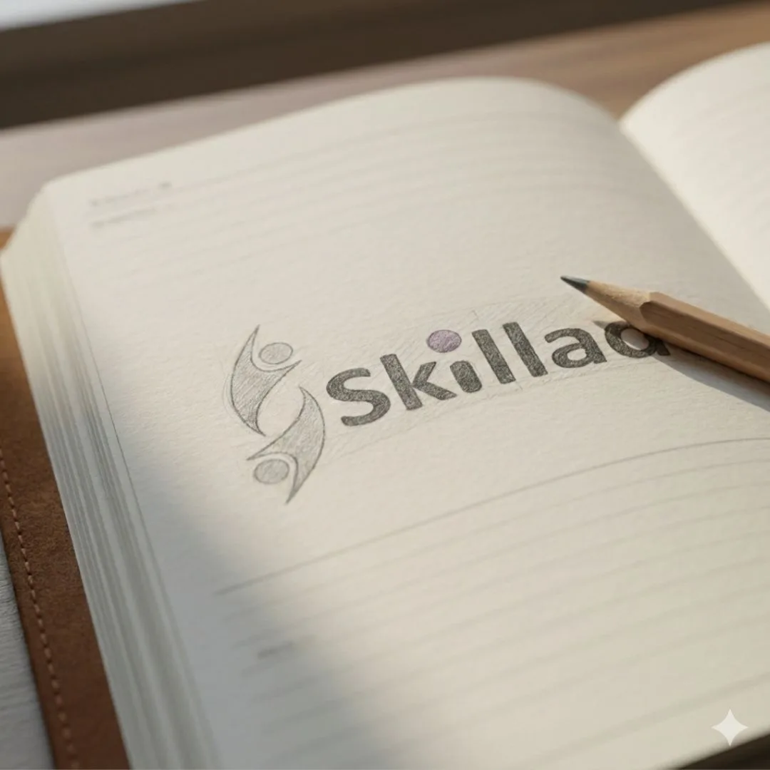
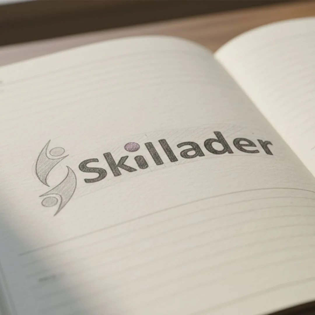
Shown in the round — reversed white on magenta, black wordmark on white, tinted app icons on yellow, and a set of mockups from a pencil sketch in a notebook to the mark suspended in magenta ink.
In motion
Applied